
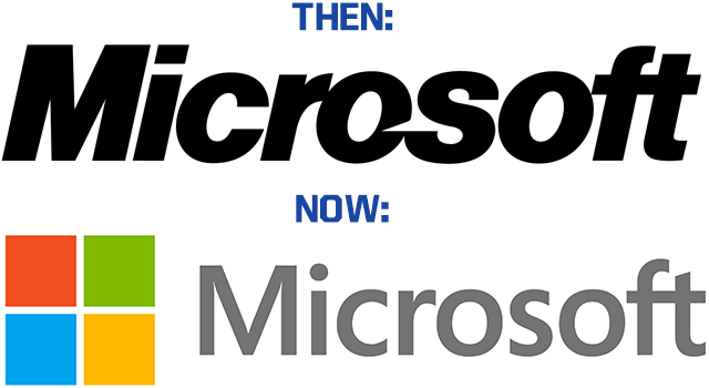
It's been 25 years since Microsoft has had a new logo. Although it's always a tricky situation when you update an iconic representation of your company, it's really long overdue after 25 years. Just look at some of the things that were popular 25 years ago:

Alright, so the high tops and U2 are still big, but Jesse "The Body" Ventura and Barry Bonds have had their share of issues.
Here's what Microsoft had to say about the new logo:
It's been 25 years since we've updated the Microsoft logo and now is the perfect time for a change. This is an incredibly exciting year for Microsoft as we prepare to release new versions of nearly all of our products. From Windows 8 to Windows Phone 8 to Xbox services to the next version of Office, you will see a common look and feel across these products providing a familiar and seamless experience on PCs, phones, tablets and TVs. This wave of new releases is not only a reimagining of our most popular products, but also represents a new era for Microsoft, so our logo should evolve to visually accentuate this new beginning.
One interesting thing to note: the "f" and "t" in "Microsoft" are still connected in the new logo. That's Microsofts way of bringing the old school into the new, and it's a cool little piece of design.
We like the new logo, but just in case you don't care for it check out the Microsoft promo video below. Because cheesy corporate promo videos are always great opportunities to change people's opinions.


